This blog now contains my complete A2 Media coursework which is ready for assessment.
You can find the different areas of my studies in the following order:
September-October: Research into similar products
November-December: Planning
December-January: Print Production
January-February: Music Video Production
February-March: Evaluation
Monday, 7 March 2011
Wednesday, 2 March 2011
Question 4 - How did you use media technologies in the construction and research, planning and evaluation stages?
I used a variety of new technologies in the creation of my video and print production, some of which I had not used before and had to develop my skills at using. I used my iPhone to upload short production updates during the production of my video. This was a useful tool as I could quickly write down how my work was progressing as I was filming and capture the thoughts and feelings I had at the moment (using 3G internet service). I used social networking sites to obtain feedback from members of my audience I could not reach in person. I mostly used Facebook however I did post links on Twitter, my own personal blog etc.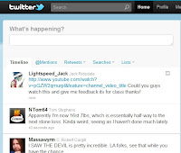

The editing program we used to construct the video was Adobe Premiere Pro. This was not my first time using this program however using it to create this video forced me to develop and improve my skills greatly, which I feel I did. I used effects such as changing the colour levels, grain levels, fast forwarding and reversing footage and slow motion. We recorded the footage in the video with a Digital Camcorder and transferred it to the computer using the program Adobe On Location. This was a good opportunity to enhance my skills at using this program, too.
To create my Print production task I primarily used Adobe Photoshop. I had previous experience with this program so I adapted to using it for this task fairly easily. I used a Digital SLR Camera to take the pictures I used. There was some technological determinism here as I found myself trying different camera angles that could not be achieved with a normal digital camera which I am used to using.
For the planning stages I used lots of different internet sites to research into similar music videos, one of the main ones I used was Youtube, which I used to research and analyse videos similar to the genre of mine and also what makes videos of other genres different. I also uploaded rough cuts of the video to keep a document of my progress, viewable in previous blog posts. I used Blogger to document my planning and to gather my thoughts. I used Photoshop to create a moodboard to draw inspiration from and Adobe Premiere Pro to create an animatic (Animated storyboard) which can be viewed here:
I used audio editing program Audacity to edit the song into a more manageable length. The song was originally over 6 minutes long and I managed to effectively reduce to running time to 3 minutes and 23 seconds.
I experimented with using Prezi to create a presentation but decided that it was not necessary for what I was trying to accomplish and used PowerPoint instead. I created a PowerPoint presentation for my music video Pitch in the planning stages. I used different slides to detail the different aspects and aims of my music video. I uploaded this powerpoint to my blog using SlideShare a web device for embedding slideshows with HTML code. I used Google and Google Images find research materials along with many other websites. I took inspiration from digipaks I own such as Plastic Beach by Gorillaz and Scream, Aim, Fire by Bullet for My Valentine.


Question 3 - What have you learned from your audience feedback?
For my audience feedback I asked my audience a number of questions which we carefully considered so as to get the optimum quality of useful comments and things that would help us in the future. We were very interested to find out not just how the target audience reacted to the video but also someone who was not in the target audience so we asked people from both groups. Our target audience would be something like this:
"I didn't really understand some of the story but it looks proffessional so good effort!"
"its starts slow but I liked the quicker pace of the second half"
"they look like a proper band, really convincing"
"a bit too similar to some other videos like you me at six so a bit boring in a way but i still found it fun to watch"
- Aged 14-20
- A fan of rock and metal music
- Mostly males, some females
- Like to attend gigs, drink, go out with friends
- Be "Individualists" and probably a student in college or secondary school
These are the questions we asked:
-Did you enjoy the video and why?
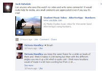
"you keep the same frame for a while on loads of them and i think it makes it a bit boring but then with the different angles you mix it up a bit which is quite cool. i think more locations would of made it a bit more exciting but from 2:18 ...when it get super speedy, like you get crazy and it looks sick and a bit more professional." - Vicky Handley, 18-Did you enjoy the video and why?
This question is important to gauge how the target audience would receive the product on a basic level and to see if the audience recognized our aims and if we achieved them.
-Do you understand the link between the lyrics and the visual imagery?
-Do you understand the link between the lyrics and the visual imagery?
The narrative of the video is deliberately ambiguous so as to represent the entropic style of the music but we hoped the audience would have an idea of the themes so we felt it important to confirm this.
-What would you change/what could be improved?
-What would you change/what could be improved?
This will help us in future work and help us reflect on the things that we failed to accomplish in the video.
-How well does this video fit the genre (rock/metal)?
This question will help us understand how recognizable the video is as a part of the chosen genre.
-How well does this video fit the genre (rock/metal)?
This question will help us understand how recognizable the video is as a part of the chosen genre.
-Did you think the editing was well done?
This question was intended to see how the target audience would react to the entropic editing style.
I also posted the video on my Facebook, Twitter and personal blog, asking my contacts for comments, here are some of the comments I received:
I also posted the video on my Facebook, Twitter and personal blog, asking my contacts for comments, here are some of the comments I received:
"I didn't really understand some of the story but it looks proffessional so good effort!"
"its starts slow but I liked the quicker pace of the second half"
"they look like a proper band, really convincing"
"a bit too similar to some other videos like you me at six so a bit boring in a way but i still found it fun to watch"
"The image of the dead girl is pretty edgy, i liked it though :)"
From these comments I decided that people found the first portion of the video a little too slow and could have been better with more movement in the camera and perhaps some more different locations and shots.
From these comments I decided that people found the first portion of the video a little too slow and could have been better with more movement in the camera and perhaps some more different locations and shots.
It seemed that most of the people who viewed the video took a preferred reading whilst some took an negotiated reading, few took an oppositional reading. The viewers who enjoyed the video took pleasure from the exciting nature of the video, the fast paced editing and energy of the performances. People who had a culture capital of the rock/metal video genre took a negotiated reading as they recognized the cliches included in our video that are a very common occurance of the genre but still enjoyed watching it anyway.
I also asked some members of my target audience about my Print Production task.
"I thought this album cover looks quite professional but maybe you could have used some different camera angles for the people in the band"
Although it was my intention to keep the camera angles consistent some people found them boring so would have preferred me to use some more varied shots.
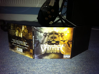
"I liked the front cover and inside but the back cover was a bit messy"
I think some people reacted negatively to the back cover because the font of the text is a little hard to read as the colours are similar to the background.
"I liked it because it's different from the standard band album art"
This comment links with the comment made by Aaron (18) in the feedback video, he commented that "the scenery is a bit random...[but it is] a good thing because it's different and not copying other things." To me this indicates that people who enjoy rock/metal music enjoy the originality of it and respond well to new, entropic ideas and things that have not been attempted before which was something I aimed to do in the planning stages and as these comments would indicate I feel I have succeeded to achieve this.
Question 2 - How effective is the combination of your main product and ancillary texts?
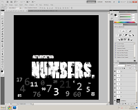
I tried to keep a consistant house style across my print production and my music video. In both I used only outdoor, Winter environments and had the band members dress in the same style, band t-shirts, jeans etc. In both the video and the print production I had the band members maintain a serious, "cool" appearance. I used a serif font across the print production apart from the front cover which I used a sans-serif large font with fading effects. I chose to do this as the serif font would be the band logo however the focus of the front cover is the title of the album "NUMBERS" so I chose to have the band title be the same as this as it was small in comparison to the album name.
We based the bands image on some existing bands such as the following:
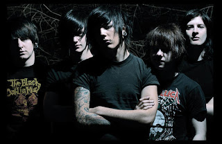
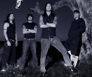
Both of these bands have similar appearances, long hair, black t-shirts, jeans, band clothing and in rural areas. The lead singer in our video is wearing the same brand of clothing as the singer of Bring Me the Horizon (first picture).
You can see in my digipak I used an effect used in the first picture and a lot of metal/rock photography which is the fading black borders, which I used around the band members faces, which gives the image a darker feel.
It was my intention that the promotional materials for this release would retain the same style so that all of the product's house style was coherent. If I could change something about my digipak it would be that I would put the band's Serif font logo on the front cover so that it was more recognisable as a part of the AlterVertigo brand. It would be very beneficial to all the products released by the band that they are instantly recognisable to the band's brand.
When marketing a band or artist through Media 2.0 it is important that you maintain a recognisable brand image as audience members will quickly dismiss something if it is not something they are familiar with. Having a consistent brand image is one of the most important elements to creating a popular band/artist however there are some artists who are famous for constantly changing their brand image for example Madonna. You can see that the woodland setting was used for both the video and the print production creating a link (Alex can be seen singing in the wood where the Digipak pictures were taken).
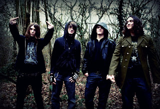

Above, the band I used for my video except for the 3rd person was changed for a different drummer.
Subscribe to:
Posts (Atom)