This blog now contains my complete A2 Media coursework which is ready for assessment.
You can find the different areas of my studies in the following order:
September-October: Research into similar products
November-December: Planning
December-January: Print Production
January-February: Music Video Production
February-March: Evaluation
Jack Ridsdale A2 Media WSFC
Monday, 7 March 2011
Wednesday, 2 March 2011
Question 4 - How did you use media technologies in the construction and research, planning and evaluation stages?
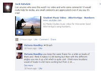
I used a variety of new technologies in the creation of my video and print production, some of which I had not used before and had to develop my skills at using. I used my iPhone to upload short production updates during the production of my video. This was a useful tool as I could quickly write down how my work was progressing as I was filming and capture the thoughts and feelings I had at the moment (using 3G internet service). I used social networking sites to obtain feedback from members of my audience I could not reach in person. I mostly used Facebook however I did post links on Twitter, my own personal blog etc.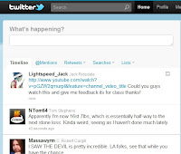


The editing program we used to construct the video was Adobe Premiere Pro. This was not my first time using this program however using it to create this video forced me to develop and improve my skills greatly, which I feel I did. I used effects such as changing the colour levels, grain levels, fast forwarding and reversing footage and slow motion. We recorded the footage in the video with a Digital Camcorder and transferred it to the computer using the program Adobe On Location. This was a good opportunity to enhance my skills at using this program, too.

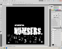
To create my Print production task I primarily used Adobe Photoshop. I had previous experience with this program so I adapted to using it for this task fairly easily. I used a Digital SLR Camera to take the pictures I used. There was some technological determinism here as I found myself trying different camera angles that could not be achieved with a normal digital camera which I am used to using.
For the planning stages I used lots of different internet sites to research into similar music videos, one of the main ones I used was Youtube, which I used to research and analyse videos similar to the genre of mine and also what makes videos of other genres different. I also uploaded rough cuts of the video to keep a document of my progress, viewable in previous blog posts. I used Blogger to document my planning and to gather my thoughts. I used Photoshop to create a moodboard to draw inspiration from and Adobe Premiere Pro to create an animatic (Animated storyboard) which can be viewed here:
I used audio editing program Audacity to edit the song into a more manageable length. The song was originally over 6 minutes long and I managed to effectively reduce to running time to 3 minutes and 23 seconds.
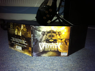
I experimented with using Prezi to create a presentation but decided that it was not necessary for what I was trying to accomplish and used PowerPoint instead. I created a PowerPoint presentation for my music video Pitch in the planning stages. I used different slides to detail the different aspects and aims of my music video. I uploaded this powerpoint to my blog using SlideShare a web device for embedding slideshows with HTML code. I used Google and Google Images find research materials along with many other websites. I took inspiration from digipaks I own such as Plastic Beach by Gorillaz and Scream, Aim, Fire by Bullet for My Valentine.


Question 3 - What have you learned from your audience feedback?
For my audience feedback I asked my audience a number of questions which we carefully considered so as to get the optimum quality of useful comments and things that would help us in the future. We were very interested to find out not just how the target audience reacted to the video but also someone who was not in the target audience so we asked people from both groups. Our target audience would be something like this:
"I didn't really understand some of the story but it looks proffessional so good effort!"
"its starts slow but I liked the quicker pace of the second half"
"they look like a proper band, really convincing"
"a bit too similar to some other videos like you me at six so a bit boring in a way but i still found it fun to watch"
- Aged 14-20
- A fan of rock and metal music
- Mostly males, some females
- Like to attend gigs, drink, go out with friends
- Be "Individualists" and probably a student in college or secondary school
These are the questions we asked:
-Did you enjoy the video and why?
"you keep the same frame for a while on loads of them and i think it makes it a bit boring but then with the different angles you mix it up a bit which is quite cool. i think more locations would of made it a bit more exciting but from 2:18 ...when it get super speedy, like you get crazy and it looks sick and a bit more professional." - Vicky Handley, 18-Did you enjoy the video and why?
This question is important to gauge how the target audience would receive the product on a basic level and to see if the audience recognized our aims and if we achieved them.
-Do you understand the link between the lyrics and the visual imagery?
-Do you understand the link between the lyrics and the visual imagery?
The narrative of the video is deliberately ambiguous so as to represent the entropic style of the music but we hoped the audience would have an idea of the themes so we felt it important to confirm this.
-What would you change/what could be improved?
-What would you change/what could be improved?
This will help us in future work and help us reflect on the things that we failed to accomplish in the video.
-How well does this video fit the genre (rock/metal)?
This question will help us understand how recognizable the video is as a part of the chosen genre.
-How well does this video fit the genre (rock/metal)?
This question will help us understand how recognizable the video is as a part of the chosen genre.
-Did you think the editing was well done?
This question was intended to see how the target audience would react to the entropic editing style.
I also posted the video on my Facebook, Twitter and personal blog, asking my contacts for comments, here are some of the comments I received:
I also posted the video on my Facebook, Twitter and personal blog, asking my contacts for comments, here are some of the comments I received:
"I didn't really understand some of the story but it looks proffessional so good effort!"
"its starts slow but I liked the quicker pace of the second half"
"they look like a proper band, really convincing"
"a bit too similar to some other videos like you me at six so a bit boring in a way but i still found it fun to watch"
"The image of the dead girl is pretty edgy, i liked it though :)"
From these comments I decided that people found the first portion of the video a little too slow and could have been better with more movement in the camera and perhaps some more different locations and shots.
From these comments I decided that people found the first portion of the video a little too slow and could have been better with more movement in the camera and perhaps some more different locations and shots.
It seemed that most of the people who viewed the video took a preferred reading whilst some took an negotiated reading, few took an oppositional reading. The viewers who enjoyed the video took pleasure from the exciting nature of the video, the fast paced editing and energy of the performances. People who had a culture capital of the rock/metal video genre took a negotiated reading as they recognized the cliches included in our video that are a very common occurance of the genre but still enjoyed watching it anyway.
I also asked some members of my target audience about my Print Production task.
"I thought this album cover looks quite professional but maybe you could have used some different camera angles for the people in the band"
Although it was my intention to keep the camera angles consistent some people found them boring so would have preferred me to use some more varied shots.
"I liked the front cover and inside but the back cover was a bit messy"
I think some people reacted negatively to the back cover because the font of the text is a little hard to read as the colours are similar to the background.
"I liked it because it's different from the standard band album art"
This comment links with the comment made by Aaron (18) in the feedback video, he commented that "the scenery is a bit random...[but it is] a good thing because it's different and not copying other things." To me this indicates that people who enjoy rock/metal music enjoy the originality of it and respond well to new, entropic ideas and things that have not been attempted before which was something I aimed to do in the planning stages and as these comments would indicate I feel I have succeeded to achieve this.
Question 2 - How effective is the combination of your main product and ancillary texts?
I tried to keep a consistant house style across my print production and my music video. In both I used only outdoor, Winter environments and had the band members dress in the same style, band t-shirts, jeans etc. In both the video and the print production I had the band members maintain a serious, "cool" appearance. I used a serif font across the print production apart from the front cover which I used a sans-serif large font with fading effects. I chose to do this as the serif font would be the band logo however the focus of the front cover is the title of the album "NUMBERS" so I chose to have the band title be the same as this as it was small in comparison to the album name.
We based the bands image on some existing bands such as the following:
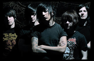
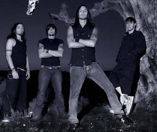
Both of these bands have similar appearances, long hair, black t-shirts, jeans, band clothing and in rural areas. The lead singer in our video is wearing the same brand of clothing as the singer of Bring Me the Horizon (first picture).
You can see in my digipak I used an effect used in the first picture and a lot of metal/rock photography which is the fading black borders, which I used around the band members faces, which gives the image a darker feel.
We based the bands image on some existing bands such as the following:


Both of these bands have similar appearances, long hair, black t-shirts, jeans, band clothing and in rural areas. The lead singer in our video is wearing the same brand of clothing as the singer of Bring Me the Horizon (first picture).
You can see in my digipak I used an effect used in the first picture and a lot of metal/rock photography which is the fading black borders, which I used around the band members faces, which gives the image a darker feel.
It was my intention that the promotional materials for this release would retain the same style so that all of the product's house style was coherent. If I could change something about my digipak it would be that I would put the band's Serif font logo on the front cover so that it was more recognisable as a part of the AlterVertigo brand. It would be very beneficial to all the products released by the band that they are instantly recognisable to the band's brand.
When marketing a band or artist through Media 2.0 it is important that you maintain a recognisable brand image as audience members will quickly dismiss something if it is not something they are familiar with. Having a consistent brand image is one of the most important elements to creating a popular band/artist however there are some artists who are famous for constantly changing their brand image for example Madonna. You can see that the woodland setting was used for both the video and the print production creating a link (Alex can be seen singing in the wood where the Digipak pictures were taken).
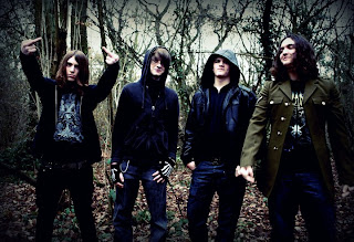

Above, the band I used for my video except for the 3rd person was changed for a different drummer.
Monday, 28 February 2011
Question 1 - In what ways does your media product use, develop or challenge forms and conventions of real media products?
Our music video uses forms and conventions of heavy metal videos however I think our video has a certain degree of originality due to the setting. We chose the set our shoot outside as we thought the idea of a band performing in the middle of a large expanse of field would be original and powerful as well as being visually pleasing. We also used woodland locations from the same area. These different locations blended together well in the final video and did not create continuity problems. We drew inspiration from a number of videos from a similar genre (Bring me the Horizon, Enter Shikari, Bullet for my Valentine).
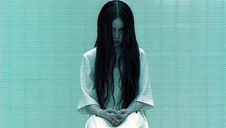
We changed the colours of the shots to create a dream or nightmare like feel, by increasing the prominence of primary colours like red and blue, which made the video seem more entropic and helped emphasise the supernatural elements of the video.
Auteur Theory could be related to our video as we tried to make sure our video had some elements of originality and was not entirely redundant.
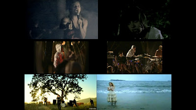 The cinematography is also similar to Bring Me The Horizon's video for "The Sadness Will Never End", in the way that the camera is almost constantly moving to reflect the energy of the band's performance. Another technique my influences used is that they often cut to other members of the band to emphasise the fact the band all play their own instruments rather than some other mainstream popartists.
My biggest influences for this video were:
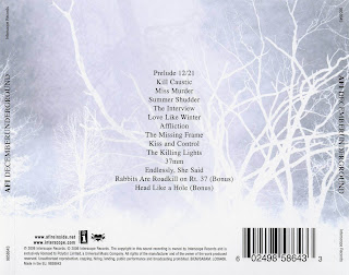
We used an image of an eerie ghost like girl which we achieved through use of costume and make-up. This is an original idea as it's very entropic and is something I have never seen before. We included this idea as it links to the lyrics. The lyrics make reference to an "abortion machine" ("Turn the key, unlock the page, the abortion machine, we abort your machine") so we used the ghost girl to represent the ghost of someone who was aborted. The message of our video was not intended to be either pro or anti abortion. This is a meaning that audiences will understand if they think about the video. Metal videos often have an ambiguous or strongly interpretable narrative that is not as easy to follow as mainstream music, we feel we reflected this convention in our production. I feel we succeeded in creating a video that both conformed to some of the conventions of heavy metal videos whilst retaining our own elements of originality and creativity. There is a intertextual reference to similar metal band Killswitch Engage as one of the band members is wearing a t-shirt sporting their logo. In my print production task I used the contrast of dark tree branches against the grey sky a technique also used in rock band A.F.I.'s album Decemberunderground:

My audience research affected the way I put together my video and print production as I learned that fans of heavy metal music usually favour non-maintream themes and like a style more serious and dark. The song is serious rather than happy so we chose to reflect this in the composure of our video. Our video repeats some techniques used by other metal/rock videos such as the shots of the band performing, the style of their clothes and hair, the fast editing style, the supernatural imagery and the constantly moving camera, rarely is the camera static.

My audience research affected the way I put together my video and print production as I learned that fans of heavy metal music usually favour non-maintream themes and like a style more serious and dark. The song is serious rather than happy so we chose to reflect this in the composure of our video. Our video repeats some techniques used by other metal/rock videos such as the shots of the band performing, the style of their clothes and hair, the fast editing style, the supernatural imagery and the constantly moving camera, rarely is the camera static.
Steve Neale describes genre as "instances of repetition and difference", this thought process can be seen in our video as we used a familiar format; the band performing inter cut with narrative imagery; but put our own spin on it by putting in the image of the supernatural girl. For this element of the video I took inspiration from Horror films such as The Ring and The Blair Witch Project. The Blair Witch Project uses hand-held cameras to shoot a horror scenario in a woodland setting. This film is supposed to look real so a shaky, always moving camera is used which is a style we tried to emulate in our video. This sense of confusion is meant to frighten and excite the audience.
The look of the girl in my video was inspired by the girl from the Ring as she has a creepy, undead look which we thought worked well with the non-mainstream style of the music.

We changed the colours of the shots to create a dream or nightmare like feel, by increasing the prominence of primary colours like red and blue, which made the video seem more entropic and helped emphasise the supernatural elements of the video.
The video does not have a set linear narrative that would fit into Todorovian or Proppian structures, instead uses imagery to display a theme while there is no real plot.
The mise-en-scene of the video was similar to Bring me the Horizon's video with the band as the main focus with cut-aways to the girl.
 The cinematography is also similar to Bring Me The Horizon's video for "The Sadness Will Never End", in the way that the camera is almost constantly moving to reflect the energy of the band's performance. Another technique my influences used is that they often cut to other members of the band to emphasise the fact the band all play their own instruments rather than some other mainstream popartists.
My biggest influences for this video were:
- The Sadness Will Never End - Bring Me The Horizon
- Waking The Demon - Bullet For My Valentine
- Anything Can Happen In the Next Half Hour - Enter Shikari
- Vermillion - Slipknot
- Stay With Me - You Me At Six
Friday, 11 February 2011
Friday, 4 February 2011
Music Video Rough Cut #2
This is the second rough cut of our music video, uploaded so that we can get some feedback from our target audience. You can see the progress we have made with this video, we have added colour effects onto some of the clips to give them an eerie feel as well as adding in some lip synched shots.
Friday, 28 January 2011
Thursday, 27 January 2011
Filming log #1
On Sunday we had our first day of shooting. We gathered the band together at 11.00 AM to begin shooting and we chose to film in a small public field near to one of our group's house. We could not shoot in our original choice of location (Croome Court) as they had not responded to our requests to film there. We set up the bands equipment and began shooting. I devised a number of shots including a mid-close up on the lead guitar player and a solo shot of the drummer from a number of different angles. We plan to have another day of shooting soon to get footage for the complete song.
Friday, 21 January 2011
Music Video Production Update
In our recent lessons we have been experimenting with using different effects on the scenery footage we shot at the weekend. After capturing our clips on On Location and importing them to Premiere, we proceeded to add different colour effects such as high contrast to give the footage a creepy feel. We also continued to trim our song to make it a more manageable length.
Friday, 17 December 2010
Storyboard Animatic
This is an animatic of the storyboard we made to illustrate our plans for the video using the edited version of the song. This is only a rough template, as in our finished video we will have many more shots than were inlcluded in this cideo.
Thursday, 16 December 2010
Magazine Advert
Finished Digipak plan
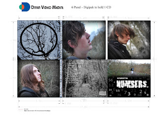
This is my finished digipak plan. I have used a woodland setting throughout the design. I used close ups of the band members for the side panels and scenery shots for the back and CD case design. The front cover has an iconic metal style picture of the frontman of the band walking away holding the guitar over his shoulder.
Monday, 13 December 2010
Friday, 10 December 2010
Digipak production update
Here is an update of my digipak front cover:
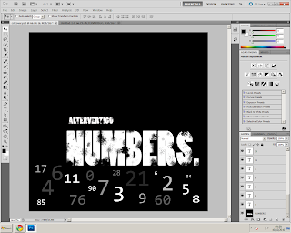
The way the numbers appear is supposed to connote confusion and complication. The way the numbers appear was inspired by this video game (Call of Duty: Black Ops):
I chose this title and theme as it is the title of the song an I believe it adds a simple and memorable title just like the bands name "AlterVertigo".
Digipak Plan
The plan for my digipak is to photograph some frosty winter scenery with my black guitar contrasting the white surroundings. This ties in with the themes of our music video. The black guitar will be a bold contrast in the frosty natural surroundings and will be a good recognisable image for the band. This design is similar to a punk rock band named A.F.I.'s album "Decemberunderground":



Mood board
Thursday, 9 December 2010
Performers/Casting
We have cast some actors who we feel have the right look to suit a rock/metal song.
Alex Moore - Guitar
Keiran Curtis - Guitar and vocals
Dan Biddle - Bass
We feel these people would enjoy performing and would give an enthusiastic and authentic performance as they play their instruments in real life.
Wednesday, 8 December 2010
Monday, 6 December 2010
Production Update
To make our video easier to complete I used audio editing program Audacity to edit down the song. I feel I edited it so that the song is still good, but a little shorter.
I changed the song from 06:48 to 05:20.
Friday, 3 December 2010
Developing Technology skills
Thursday, 2 December 2010
Test shoot; Jump Cuts
This is a test shoot our group did to test the "Jump cut" technique which we plan to use in our video.
Media Trip Evaluation; London 2010
A group of media students went to London for a music video workshop on the 9th November 2010. We got to hear tips and a step by step guide from the chief examiner, Pete Frasier on how to plan and create our music video. We also got to hear some music video directors working in the industry producing videos for artists such as Paulo Nutini and Biffy Clyro, give us advice on making our music videos and also an insight into what it is like to work within the industry. It was particularly interesting to listen to Corin Hardy as I was already familiar with his work on videos from Biffy Clyro and The Prodigy. The chief examiner put into perspective how many shots are involved by explaining that each minute of film must contain at least 50 shots, far more than that of a film or television show. This means that our song at just over 4 minutes long will clock in at over 200 shots, total.
AVERAGE SHOTS PER MINUTE: 50
4 MINUTES OF FOOTAGE = 200 SHOTS
What follows are some notes on the process of planning and creating a student music video:
Step 1:
Before we begin filming proper, Pete advised that we do test shoots (which are group has breifly started) and experiments with different types of footage and audio. Learn to lipsync and do practise videos and experiment with multi-angles.
Step 2:
Do good planning. Have a strong and simple idea. Don't be too ambitious but don't use a boring idea either, strike a good balance between a realistic, doable idea and an exciting idea that will be interesting to watch.
Step 3:
Be organised. Make sure you have everyone's numbers and you are sure you know what each person is doing. Plan in detail costumes, locations, props, actors. Shoot early and make sure your performers are rehearsed and prepared (know all lyrics etc). Make a detailed storyboard and possibly an animated storyboard.
Step 4:
Blog and take notes of any useful ideas you get. Make notes of influences and things that inspire you.
Step 5:
Get to know equipment and editing software before filming. Bring speakers to play music on and be prepared to try practised techniques.
Step 6:
Shoot performance at least 10 times to make sure you have enough footage. Have plenty of cutaways and remember you need many shots. Shoot more than needed. Use lots of close ups and enthuse your performers.
Step 7:
When editing label each shoot and break footage apart into manageable chunks. Make sure you capture the whole performance more than once.
Step 8:
Cut constantly, get whole picture rather than small detail. Keep screen grabs of each edit.
Step 9:
Get lots of feedback and post on blog. Show what you've learned/improvements. Utilise Youtube and it's comment system. Also sites such as Facebook, Twitter etc.
I plan to use these notes as much as possible during the production of our video.
Digipak design planning
Thursday, 18 November 2010
Our Pitch
This is the powerpoint presentation for our music video, "Numbers" by AlterVertigo.
We recieved some good feedback from our classmates which helped us consider whether we were going about our video in the right way. Many commented that the zombie/undead idea would be to difficult to look convincing in a student video, however if we take a more symbolic approach I feel the eerie atmosphere and effect can be acheived. Here are some of the comments students in our class gave to the powerpoint presentation:
We recieved some good feedback from our classmates which helped us consider whether we were going about our video in the right way. Many commented that the zombie/undead idea would be to difficult to look convincing in a student video, however if we take a more symbolic approach I feel the eerie atmosphere and effect can be acheived. Here are some of the comments students in our class gave to the powerpoint presentation:
- "Sounds really interesting but it could be hard to achieve a convincing looking undead creature."
- "I love the ideas and look forward to seeing the final product. I like the location choices and theme of the video."
- "The song is a good choice for this kind of video, could be difficult to achieve but still soundss good."
Monday, 15 November 2010
Audience Board
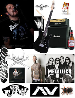
This audience board shows a variety of imagery that we associate with out target audience. This includes interests, hobbies and preferences. It would be mostly males aged 16-20. They would be interested in going to gigs, getting drunk with friends and would be described as hedonists/individualists, ranking c1-D on the Jicnar scale. Many will still be in education. They will enjoy bands such as Metallica and Rage Against the Machine and will like tattoos and activities such as skateboarding.
Friday, 8 October 2010
Spike Jonze
I have chosen to research music video director Spike Jonze. Spike Jonze has directed such famous music videos as "Buddy Holly" by Weezer and "Praise you by Fatboy Slim.
Spike Jonze's videos have a high level of entropy as he often tries to create something outside of what you would expect from a standard music video. The "Buddy Holly" video is entropic as it is not what you would expect from this band. Weezer are a rock band so you would not expect them to adopt the smart, formal style of the 1950s band and the audience would also not expect this kind of setting (TV show "Happy Days"), you would probably expect them to adopt a more "rebellious" and entropic attitude like many other rock bands. The video also uses audio from the original TV show, which is unusual for a music video. You can see throughout all of Spike Jonze's videos that all of them have an entropic twist, none of them conform to genre conventions which is what makes them interesting and different. Spike Jonze's original and creative videos show an Auteur signature of entropy and comedy as most of his videos have an element of comedy to them, often from the strangeness of the video itself. Most of Spike Jonze's videos don't adhere to Proppian or Todorovian narrative structure, they are instead more abstract art pieces. The target audience for "Buddy Holly" would be tennage males aged 16-20, probably students or C1, C2 or D on the Jicnar scale.
Digipaks
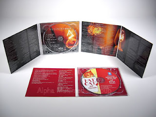 This is an example of a digipak. Digipaks are a four panel paperboard case with a plastic interior containing a CD, DVD and lyric booklet. This form of CD became popular in the early 2000s, offering the consumer more content for their money. Digipaks are the "Premium" edition of a music album allowing the artist to include extra content such as music videos, "making of" documentaries, interviews, photo galleries etc. Digipaks are slightly more expensive than regular CDs. These types of CD are more popular nowadays as they offer more value for money as opposed to a simple download., also offering extra content unavailable anywhere else.
Research and Planning
This is a typical pop music video. The style of this video is Performance/Narrative as there is a small thread of story but we mostly see Katy Perry performing ; singing and dancing. I would classify this video as "Amplifying" as it is not directly representing the meaning of the song instead showing a fantasy world that still fits in with most of the lyrics. This video shows a lot of typical conventions of pop music videos such as the sexualised females and lots of focus on the main singer, with lots of close-ups. Because of this I find this video redundant however it has a degree of entropy depending on the audience because of unusual "Candyland" setting. The video represents women in a way typical to music video conventions and the ideology of pop music. Women are mostly displayed in a sexualised way or as "sex objects". The way the main singer is shot with lots of close-up and the mise en scene and costume creates this idea of sexual objectification. The way the singer in this video is represented is voyeuristic which relates to Laura Mulvey's theory that film is seen through the point of view of a heterosexual man and as such are often represented as sexualised and fetishistic, this point of view is especially evident in the video from 00:57 - 01:08. This theory is known as "The Male Gaze". The target audience for this video would be 12-16 year old girls who are students at school. They are mainstreamers and will listen to anything that's on the radio. It also has a smaller audience of teenage males who enjoy the video for the sexualised females and the guest vocals by rapper Snoop Dogg. Many viewers will take an oppositional reading and think that the depiction of women is over-sexualised.
Friday, 1 October 2010
Research, music videos
This music video is very entropic. The way the band is shot as they play is quite redundant and generic as we see this style of filming in lots of heavy metal videos. The fast paced editing goes well with the fast tempo of the song. The imagery of the old man working on insects in entropic as the audience doesn't know what it is intended to mean. The lighting is typical of heavy metal videos dark but with bright background lights. This style of music is entropic as it is very heavy and uses mostly screaming vocals. The mise-en-scene has the band performing in a small room in which the old man is seen working. The style of the video is dark and serious which reflects the tone of the music itself. The target audience for this video is 16-19 year old males, most likely individualists who are probably D or C2 on the Jicnar scale, possibly students, middle class. This audience would identify with the members of the band and may have aspirations to be in a similar band and play and instrument.
Tuesday, 14 September 2010
Redundancy, Entropy, Convention and Genre
"Generic texts have mass appeal." - I agree with this quotation to a certain extend as the more people that can identify with the subject matter the more people will enjoy it, however if something is too generic then audiences will find it boring and repetitive. Music videos must strike a good balance of generic ideas and entropic ideas to appeal to the largest audience.
"Creative media texts are highly entropic." - This is true because all creative media must have an element of entropy or else it would be boring and worthless. People are intrigued by creative media because it adds the element of entropy that we would not normally see in everyday life. Most creative texts also contain a lot of redundant elements as well, some more than others depending on genre, so that most people can relate and understand it.
"Genre is dependant on high degrees of redundancy" - The recognisable features of a specific genre can be considered quite redundant as in order to recognise it as a part of a genre it must contain elements that we see in all media of this genre.
Redundancy and Entropy in Music Videos
This video is quite entropic but is easier to understand if you can follow the narrative. This video makes fun of other types of music that aren't heavy metal type music such as the Goth band, the pop singer, the rappers, the acoustic guitar band etc. At the end of the video all these bands die and the real band comes in to finish the song. The last shot reveals that the other musicians were killed by a Death Note. This video is entropic as we don't expect to see all of these musician stereotypes in one video even though it is making fun of them. The image of the goth band is entropic as they have a very unusual and over the top look about them and its not something we expect to see. The second half of this video is quite redundant as it is what we would expect to see in a heavy metal music video which is the band performing.
This video is entropic as the appearance of the monster is something bizarre that people would not expect to see in a music video.
Friday, 10 September 2010
Video Skills - Technical and Planning
Creativity/Originality - I think the most important thing in a creative project is to have an original idea. I am confident that I can think up interesting and original ideas in most areas of media.
Camera Skills - I would like to improve my camera skills as I have not had much experience with operating the camera.
Storyboarding - I need to do more storyboards as they are the best way of displaying how the film is intended to look. You can use photographic storyboards or drawn storyboards, drawn storyboards are mostly useful for planning whereas photographic storyboards are useful for analysis after the filming is finished with.
Actors, performers and Models - It is important to get the right person for the role and in order to get the best performance it must be clear to them what the intention of the work is, so it is important to communicate well with your performer.
Reconnaissance - I need to do more recce as I have previously overlooked this part of the work. I will make notes on lighting, possible noise sources, health and safety implications, etc as often as possible.
Monday, 28 June 2010
Music video task
We re-created the first 50 seconds of the following video, "What I Go To School For" by pop group "Busted":
Digital Technology - During this task I became more proficient in using the digital video camera, over the course I would like to develop my editing and filming skills so that I can produce high quality footage in a shorter amount of time.
Research and Planning - For research and planning our group created useful things such as a video storyboard and a shooting script. The shooting script proved very useful for helping the group get organized and working around times when some members of the group were absent. The shooting script made the filming process much more efficient because we instantly knew what was needed for the shot and helps us get organized. The video storyboard was even more more useful as allowed the group to see each shot quickly as well as the timing for each shot.
Post-Production - I improved my editing skills and enjoyed using programs like Premiere Pro. I began to consider things such as continuity and the flow and timings of shots more than before. When making a music video I had to consider how the timing of each shot went with the beat and rhythm of the music.
I feel this project could have been improved if we had redone some shots that didn't come out as well as we had hoped and by also getting more people in the class so it looked more realistic.
Thursday, 17 June 2010
A2 Media
Preparing and Planning - We need to do more planning next time as this time we pretty much did it on the fly.
Filming - We did some good shots using the whiteboard however we should work on positioning the shots better.
Working with performers - I realised thatinvolving myself would make my co performer more confident and willing to participate
Terminology - I have learnt many new words which are useful in the production of music videos, particularly editing and filming terms such as high angle and low angle and ripple effects.
Subscribe to:
Comments (Atom)


